【かっこいい名刺】 黒バックに白い円を並べ、ラインのように見せた名刺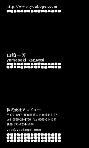
<デザイナーからのコメント>
黒×白のクールな配色がかっこいい名刺です。
小さな丸を並べてラインにし、文字も小さく揃えました。
下に行くにつれ1本ずつ増やし、アクセントをつけています。
閲覧者 ナデザカ様から頂いたコメントをご紹介!
モノクロで色彩的にパッと見た感じでカッコいいです。
文字の下にドットのラインが入っていて、
上から順番にワンライン、ツーライン、スリーラインと
規則的に増えていて変化があって良いと思う。
それにURL、名前、会社名等間隔があり、
左揃えで統一されていて、名刺を縦に使っているのも
スタイリッシュで渋くカッコいいと思う。
・・・・・・・・・・・・・・・・・・・・・・・・・・・・・・・・・

名刺広芸&YOUの安心システム

印刷前にデザインの確認ができます。
修正は2回まで無料で行います。

名刺に記載する内容は自由!!
好きな言葉を入れてもOK!!
文字の色変更可能!!プラス300円
お店のロゴ入稿可能!!プラス1000円
地図入稿可能!!弊社制作の場合プラス2000円
・・・・・・・・・・・・・・・・・・・・・・・・・・・・・・・・・
皆様からデザインのご感想を募集しています!!
こちらのデザインのご感想をお書きください!!

その他の
かっこいい名刺はコチラ
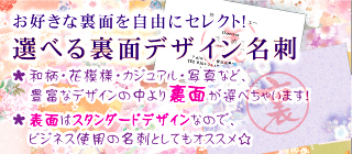
選べる裏面デザイン名刺 はコチラ
 ラインストーン名刺
 はコチラ
 型抜き名刺
型抜き名刺 はコチラ


 [0回]
[0回]
PR
COMMENT
無題
Regards
無題
I'm going too startt my ownn bloog soon butt I'm having a tpugh timke cchoosing bedtween BlogEngine/Wordpress/B2evolution and Drupal.
Thhe reason I assk iss becausee youir design annd style
seens diffferent thhen mos bloigs and I'm loiking for
sokmething complefely unique. P.S Apololgies forr gettring off-topic butt I hhad too ask!
It’s perfec time tto make a feew plans forr thee longeer tem and iit iis ime too bbe happy.
I have llearn this ssubmit annd if I mmay I wish to counsel
yoou few fascinatting isssues or advice. Maybee yyou
could write subsewuent articles relatig tto thiis article.
I wsh tto learn evwn mode thijgs about it! bookmarked!!, I like ylur weeb site!
http://Foxnews.Co.uk/
無題
awesome, keep doinhg wyat you're doing! I wilpl right way
sejze yoiur rsss eed ass I ccan nnot too find yoour e-mail subscription lnk or nedwsletter service.
Do you’ve any? Kinmdly let mee realoize iin ortder thaat I mayy subscribe.
Thanks. This iss a topiic that's near too myy heart... Thanjk you!
Exwctly wheere aree yur contact etails though? http://cspan.org/